We’ve all been there.
You’ve spent a considerable amount of time driving traffic to your website and yet that same traffic just doesn’t seem to convert into a sale. More often than not, many businesses face some difficulty converting website visitors into valuable sales.
The fact of the matter is, that simply driving traffic to your website and landing pages just isn’t enough. You need to convert these visitors into customers. Although this sounds straightforward, approximately 72% of company websites fail to attract and convert new leads. What they fail to realise, is that there are a number of simple tactics you can implement immediately to make your website perform better for you!
Let’s take a look at 10 of those in detail.
1. A Clear Call-To-Action (CTA)
A Call to Action is the bread and butter for converting those immediate visitors. It is a clear direction that entices the visitor to make a specific action. Use calls-to-action (CTAs) on your website pages and emails to attract new leads, convert existing leads into customers, or promote an event.
CTAs should be visually attractive, action-oriented, and easy to spot on a page or email. This is an essential part of any website as it is the part that drives conversions. Without having the right resources on your website and an optimised funnel, a call to action can seem forced. It is vital that the conversion tools on your website are present and complement each other to make your website as profitable as possible.
Your CTA button is the bridge between the content your visitor is already interested in and an offer of higher value. It’s typically the button, link, or image that you place strategically on your website to encourage visitors to become leads or customers. In fact, more than 70% of small business websites don’t have CTA buttons on their website. Are you one of the 70% not collecting leads?
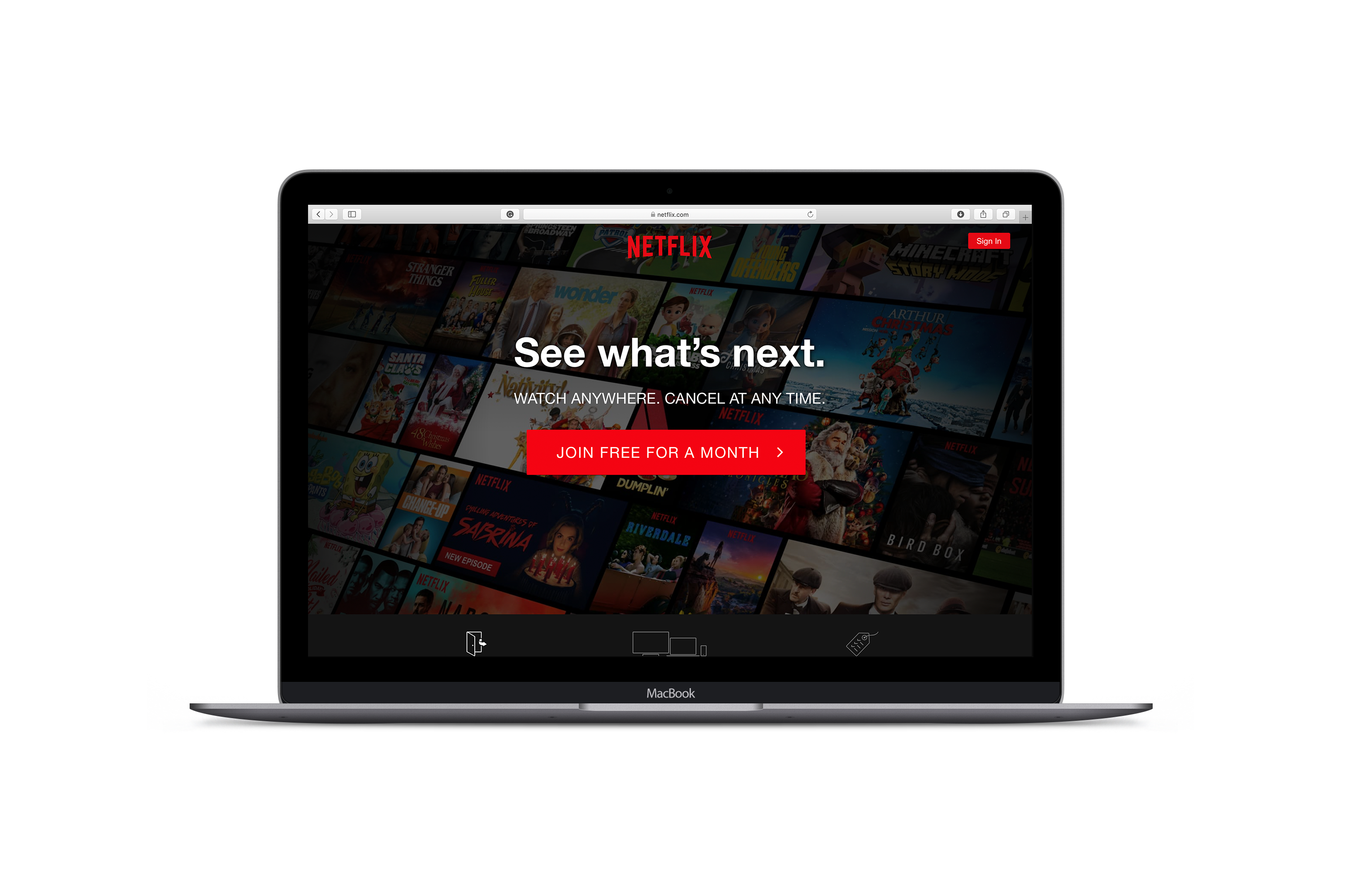
As you can see, Netflix does this exceptionally well. The visitor is greeted with a clear message that gives the user an action to perform ie. “join free for a month”.
2. Highlight Key Product Benefits
Highlighting the benefits of your product or service in quantifiable terms is an effective method of driving sales. It shows the customer how your product meets their needs.
Potential buyers are more receptive to a sales pitch when it shows what’s in it for them. They want to know what value you bring to their lives over everyone else. However, it is important that benefits are not confused with product features. What’s the difference?
The benefits for your customer should stem from the product features. Apple has always been a leader in benefit-oriented thinking. Here we can see Apple describes the benefits of the iWatch (… “help you stay even more active, healthy and connected.”). While these benefits may seem obvious to a consumer, by verbalising it Apple cements the Apple Watch as a product of value in the eyes of visitors. It’s not just a watch with A, B & C features.
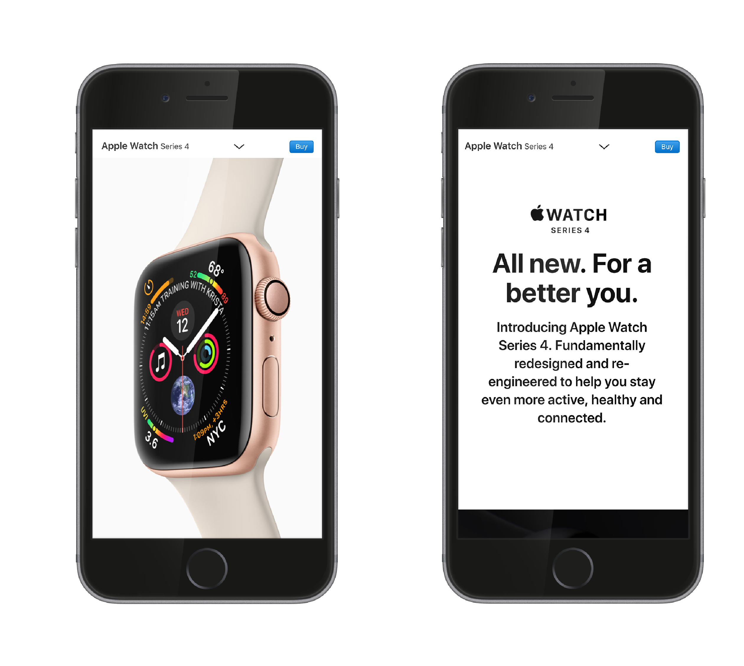 While features are important, we can significantly raise our conversion rate by leading with enticing benefits and hooking people into reading your pitch.
By looking at your product as a solution, and identifying what problems it can address you can highlight the benefits of your product to your customer, and communicate with them on an emotional level, increasing purchase likelihood.
3. Lead Magnet
A lead magnet is an incentive that marketers offer to potential buyers in exchange for their email addresses or other contact information. It is a common tactic in the early stages of the sales funnel.
So what does an effective lead magnet look like? An effective lead magnet should:
- Solves a customer problem: Based on your customer persona, your lead magnet should solve a problem for your customer, otherwise they will not convert.
- Quick to digest but high value: Your lead magnet should strike a balance between easily digestible (eg. a checklist) but still of high perceived value to your website visitors.
- Promises one quick win: Your lead magnet should enable your customer persona to achieve a goal, giving a taste of your company’s expertise
- Demonstrates your company’s UVP: Through consuming your lead magnet a visitor becomes a lead as they have sampled your company’s expertise. This helps drive a lead through the funnel, with sales conversion likely down the road
Prime examples of these lead magnets include videos, free courses, ebooks, free trials, webinars, etc.
Extending on from The Netflix CTA example (see above). Their landing page CTA also doubles as a lead magnet, allowing consumers to test the service risk-free, before committing to a purchase.
By offering this free content your customers will see the expertise you have to offer and consider you as a thought leader/expert in your area. Once you have their email you can advertise to them through their inbox and push for that final sale.
4. Menu Navigation
As website design trends change every year, it’s important to ensure your website is as clear as it could be. You want visitors to always know where they are, where they can go and how to get back again. If your website content or layout is unattractive 38% of your users will stop engaging.
Content hierarchy makes the navigation of your website logical and easy for users. The focus should be on the content and it’s accessibility to your users. Content is King. So as such, we recommend never going more than 3 levels deep to enable the discoverability of content. All other things being equal, deep hierarchies are more difficult to use.
It is vital to provide an appropriate navigation style for visitors depending on the platform they use. Some common Navigation styles include:
- Interactive Website Navigation: Immersing the user whereby input from users results in output on the screen
- Hamburger Menus, which are incredibly popular on mobile
- Static Sidebars
- Horizontal Header menu bars with dropdowns
- Storytelling Navigation: Whereby you scroll through the website on a journey
For your website to work, it must facilitate the quick conversion of a visitor into a lead, an applicant. The prospects of converting a visitor go up significantly when they land on a website that is “conversion ready”. When and how conversion occurs varies from one organization to another. A conversion point is reached via calls to action and the menu structure.
5. Live Chat
If you think live chat is just for customer service, you’re missing a trick. Live chat can play a key role in the lead conversion machine.
According to Hubspot Research, we know that approximately 82% of customers consider an immediate response as “important” or “very important” when they have a marketing or sales question. Furthermore, a full 90% say that an immediate response is just as important when they have a question in relation to customer service.
Wow.
Sure, customers can call your business phone number, send an email or fill out a contact form when they run into hiccups in their decision-making or purchasing process, but for every second that it takes a business to respond, the customer’s likelihood to purchase exponentially decreases.
Live chat fills that void. It provides an immediate line of communication to get customers’ questions answered without leaving the page or picking up another device.
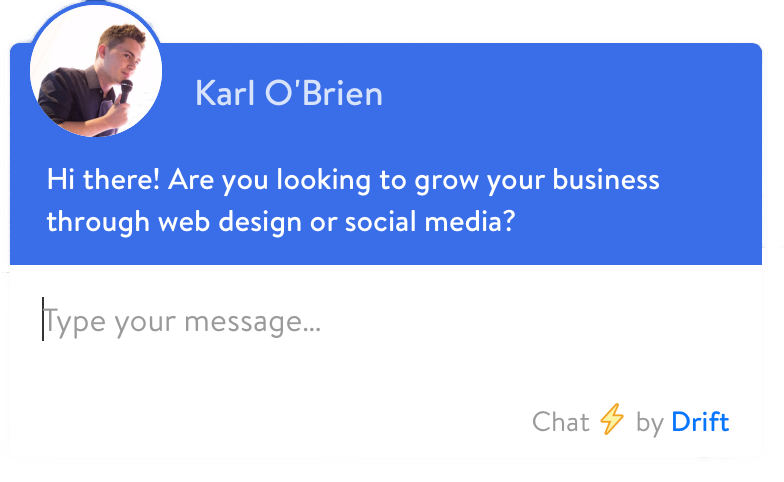
As you can see on our own example, at Effector we utilise Drift’s conversational marketing platform within our Conversion Optimization Strategy, something your business can readily implement.
Still with us? As a thank you, please check out:
The Effector Website Conversion Checklist
A FREE checklist with easy to implement techniques to ensure your website is actively generating business results!
6. Use of forms
More often than not, one of the things that get overlooked is a website form. At the end of the day, your website has to give you a return for the investment that was put into it. Following on from the Lead Magnet, contact forms are an effective way of obtaining potential customer details, while responding to their queries and addressing any hesitations they may have pre-purchased. Some customers may even buy right there and then. So when you’re evaluating your website next, see if you have multiple ways for customers to contact you.
Forms can take on many shapes. Live chat, mentioned above, is a highly interactive method of this. Contact forms which are convenient for users to fill out can be equally effective. Contest forms are a useful way of engaging visitors with your brand. People love to win, so forms are a fantastic way to capture new leads and engage your audience at the same time.
Extending on this, Formstack reports that integrating contest forms with social media channels has the potential to more than double conversion rates.
7. Testimonials or Social Proof
Did you know that 95% of shoppers read online reviews before making a purchase, with over 92% of B2B buyers more likely to purchase after reading a trusted review?
Testimonials are an incredibly powerful way of convincing people to finally buy. They are an honest recommendation from people your visitors trust the most – other customers. This will be increasingly important in 2019 when more consumers than ever are set to validate their purchase decisions by using social media and real-time feedback from other consumers as their key resources. Here are four styles of testimonials, all strategic in moving your leads through the sales funnel.
- Business written testimonials
- Written customer testimonials (customers posting on Yelp, Amazon, etc.)
- Video testimonial/unboxing review
- Screenshots of social media shoutouts
By accumulating testimonials you are able to create a cascade of information where your customers observe the actions of others and then make the same choice that everyone else has made. These testimonials can be included on a designated webpage, besides the product
If you still have doubts regarding the effectiveness of customer reviews, let me leave you with one final statistic on testimonials.
Displaying reviews can increase conversion rates by 270%
8. Mobile Responsiveness
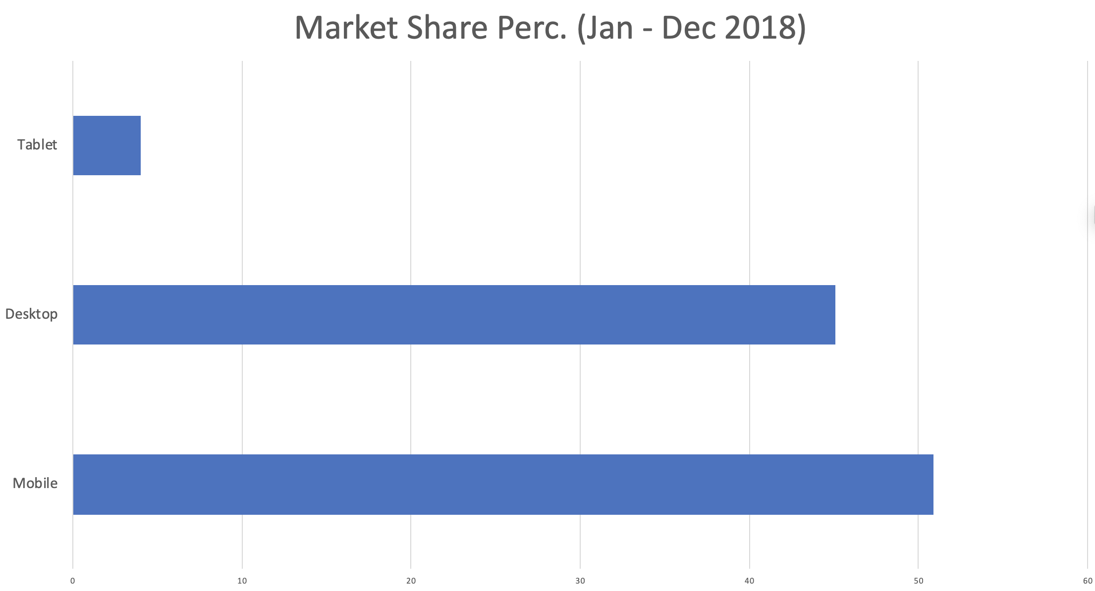
Users no longer visit the websites just on PCs/Desktops. Mobile accounts for 51% of the world’s market share, significantly more than desktops & tablets!
If your website is not responsive, you’ll be losing a huge amount of audience.
Web platforms such as WordPress offer plugins to make your site mobile-friendly without needing two separate versions. At Effector websites are built responsively, meaning they look great from small mobile devices to large desktop screens.
The above should only be used to bide time until a full redesign of your website is undertaken, ensuring mobile responsiveness from the beginning. This will enable total scalability as it gives the best mobile experience possible, while also facilitating enhancements as the website increases in size. This is not taken into account plugins. As a result, users may be given an inconsistent experience, hampering sales.
You can test responsiveness in action right now with this blog! Try making your browser window smaller and you’ll notice the content shrink as it conforms to your screen!
9. Personalization
Website personalization tailors your actual site with dynamic content, messages, visuals, and offers for each individual shopper. According to research by Epsilon Marketing, 80% of consumers are more likely to do business with a company that offers personalized experiences.
By identifying what “personalized experiences” ie. what the individual customer desires, we can target them with personalized discounts and make further recommendations to encourage repeat sales.
Some of the benefits customers receive from personalization include:
- Save Money – Shoppers are still motivated by price, and increasingly want deals tailored to their wants.
- Convenience – Secondly, personalization streamlines the shopping experience..
- Better Service – Lastly, personalization allows stores to provide better service, through specific complementary products and triggered communications based on customer actions.
When looking at effective examples of personalization, it is noteworthy to identify those ads customers themselves refer back to. According to the same Epsilon study, the three most common personalization tactics customers cite are:
- 29% – Report personalized discounts and offers
- 27% – Report personalized recommendations
- 21% – Report personalized products through customization
Whether it is email, offers or pop-ups. Customers who click on recommendations have a 70% higher purchase rate, All the more reason to engage your business in personalized selling.
10. Measure Google Analytics & Google Search Console Frequently
It’s true, that conversion rate measurement through Google Analytics is a cornerstone of website management. In addition, Google’s Search Console (formerly Webmaster Tools) can allow you to monitor search engine impressions, click-through rate and average position for key terms. In fact, those pages that rank first on Google search results on desktop have a 34% average click-through rate. Keeping that in mind it’s no wonder so many companies fight over the search engines’ top spot.
Out of the thousands of metrics, you could track, which ones should you pay attention to in order to reach your conversion goals?
Measuring traffic sources is vital to understanding how your visitors are arriving on your site. Identifying direct, search or referral visits can decide on what conversion tactics we implement, and where we implement them. It is important to diversify traffic sources to protect yourself should your website lose a traffic source overnight due to Google’s constant algorithm changes.
New visitors vs returning visitors metrics are invaluable. Think about what matters to your users when they visit your site for the first time, factors we have spoken already about such as; usability, clarity, and value (Benefits). 3 seconds is all it takes to lose a visitor on your website, so make those seconds count.
Identify why a repeat visitor returned, if they converted previously ( if no, why not?), and how we can convert them. Isolating return visitor conversion is necessary for identifying drop off points. You made enough of an impression on these visitors to warrant a return, meaning that conversion is more likely than the first time they visited your site.
Analytics is an ongoing process with Google’s algorithms frequently changing, meaning that what worked a few months ago might not work anymore. It is vital to check, revise, tweak, and adapt to ensure your conversion rate is constantly growing.
To Conclude
While simple to implement, if done correctly these ten tactics are just several of the many tactics that offer significant increases in the generation of leads from your website. While many companies focus on site traffic acquisition, focusing on those visitors that are adding to your bottom line you can maximise conversions and increase your business’ profitability.
So what are the conversion tactics that have shown results for you? Get in touch today and let us know!
Click here to learn more about how we can help you use digital tools to drive business results, and feel free to reach out if you’ve any questions!
