We’re not breaking any news to say that B2B sales cycles are in most cases longer than B2C. It’s estimated that B2B buyers conduct approximately 12 searches before making any purchasing decisions in 2022. B2B customers often won’t engage with you purely on the back of your website. A strong B2B website can bridge the gap and give potential buyers enough confidence to sit down or jump on a call with a sales representative.
With that in mind, it’s important that your website stands out from the crowd and captures the attention of the B2B buyer while providing them with the relevant information. A high converting website is one of the ingredients for achieving stellar success for your B2B brand. Your website should serve as an effective tool in your overall B2B marketing strategy. Without a high-converting website, you could be missing opportunities to win new business.
It should take prospects from making simple enquiries to taking some action, whether they are requesting an estimate, subscribing to your service or downloading an ebook. Your site should also focus on converting users with well placed CTAs, starting with your most desired conversion goal.
So how do you make your B2B website more strategic?
We’ve put together 6 tips for building a high converting website.
Have a unique value proposition on your homepage
The B2B marketplace is highly competitive with saturated categories and similar products threatening to dilute your brand. The decision-making process for B2B purchases is often more defined. Most clients in each sector look to speak to at least 3 comparable providers. To make your brand stand out you need a unique value proposition that is obvious to your website visitors and gives them a reason to pick your product/service over your competitors.
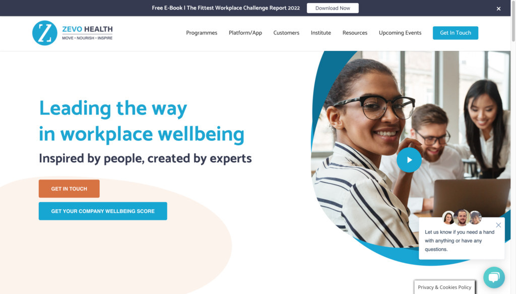
Your value proposition should be immediately visible on your homepage.
 Create Call To Actions that work
Calls to action (CTAs) play a vital role on all websites. They guide your users through their buying journey, keeping them engaged with your content and can convince them to convert. Your CTAs should anticipate the needs of your users by offering them valid and enticing suggestions of what to do next. High converting CTA’s are no longer than 4 words such as ‘start free trial’, ‘book a demo’ or ‘get started now’. Your CTAs should be in line with your business objectives and what you need visitors to do when they land on your website.
Make your website navigable
You want visitors to always know where they are, where they can go and how to get back again. You shouldn’t go more than 3 levels deep. Every additional step in the process is an opportunity for visitors to drop off. Having a clear navigation solves this. You want people to be able to reach each section of your website as quickly as possible in order to speak to their specific problems & the solution you can provide.
Think of a website you’ve visited recently that was hard to navigate. Remember how frustrating it was to find the information you were looking for? That’s what it’s like for your prospects too!
Your website holds so much information that it’s important to present the information at the right moments and in a digestible format to effectively portray your mission, vision and values.
B2B products and services can often be complex for buyers to understand. It is important for your menus and site structure to be clean and straightforward and show what your site visitors want to see first.
Have a responsive website design
Up to 20% of your website traffic comes from mobile devices and is continuing to grow as B2B buyers can take their work with them wherever they go. The device may differ depending on the stages in the decision making process with some B2B buyers saying they may research a B2B website on mobile but purchase on desktop. Having a mobile optimised site is no longer an option, but is a necessity. Your site needs to be designed to adjust to fit any screen size. If your website is optimised purely for desktop, it will distort its layout on a mobile device, leaving prospects confused and frustrated, resulting in fewer conversions.
Boost website performance
Website performance is an important factor in determining search ranking. It is affected by page speed and asset loading times. The average user expects a website to load in around 2 seconds after they have clicked a link. If your website takes any longer than that you’ll likely see visitors leaving your site, increasing your bounce rate and decreasing conversions as you miss opportunities to nurture relationships with website visitors.
You can decrease your site loading page by:
- Reducing the number of redirects
- Optimising and compressing images
- Limiting the number of plugins on your site.
Incorporate Social Proof on your B2B site
Social proof is the idea that prospects will adapt their behaviour according to what other people are doing. Prospective customers love reading case studies, blog posts, reviews/client testimonials and other content that shows how you’ve helped similar businesses achieve their goals. Placing the logos of business customers on a B2B website can increase conversions by as much as 400%.
Your B2B website can drive leads and conversions, bringing you closer to your business objectives.
It’s time to take action. Reach out to a member of our team and we’ll help design a high converting website for your business.
