
 #
#
Overview #
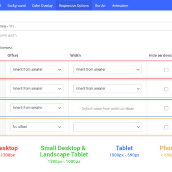
The Responsive Options tab allows you to define the size/position you want your column to display at in each viewport. By default, a column will display at 1/1 (100%) in tablet/phone viewports. You can easily override this to create the column setup desired by using the following options.
Width #
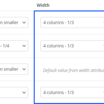
The width field will set your column to a new width on the specified device. Let’s use an example of having three columns (1/3) on desktop and assume that we want them to remain as 1/3 for mobile viewports as well. To accomplish that, we simply set the width to be 1/3 on all viewports.

You may have noticed that the tablet viewport does not allow you to define a custom width – This is a default limitation within WPbakery. However, we’ve added an option specific to Salient that allows you to work around it. To specify where your column width inherits from on tablet, you can use the dropdown labeled “Tablet Column Width Inherits From“, which is located directly under the responsive options table.
Offset #
The offset field allows you to move your column from its default position by a specified amount. While it’s not used as frequently as the “width” dropdown, there are two scenarios in which you’ll find yourself using this field.
- You’ve set one of the columns in your row to hide on a specific device, and need to offset a column that’s still visible in order to center it.
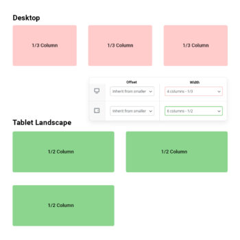
- You’ve specified column widths that equal larger than 1/1 and are pushing a column onto a new “row”. For example, let’s say you had three columns (1/3) on desktop, and on tablet you set each of the widths to a new custom value of 1/2. This would push the third column onto a new row, which could be centered by using a 1/4 offset.

The third column in the row is now left aligned, but what if we would like it to display centered? #

With a column offset added, the third column can now remain centered #
Hide On Device #
This option allows you to hide a column from displaying on a given viewport. The column will be hidden using CSS and still exist within the HTML structure.


