
Table of Contents
PAGE BUILDER #
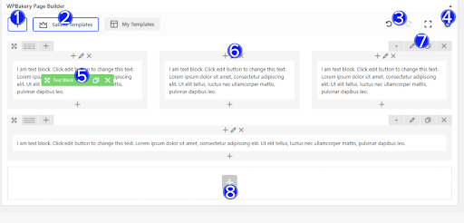
- Page builder: This is a visual composing tool used to assist you in laying out a webpage and is toggled by the PAGE BUILDER button
- The row column layout selection is where you can select what column layout will be used for the row and is identified in (1)
- The Salient Templates (2) is a section of predesigned templates exclusively from ThemeNectar which you can put into your webpages.
- The back/forward history state (3) controls for every change in the webpage
- The settings icon (4) is a section to add your own custom CSS to the webpage. This is used for styling.
- Element controls: The pencil icon will bring up all configuration options, the next icon will allow you to clone the element and the trash icon will delete the element. (5)
- Column controls: The plus icon allows you to add more elements into the column, the pencil will bring up all column configuration options and the trash icon will delete the column. (6)
- Row controls: The pencil icon will bring up all row configuration options, the next icon will allow you to clone the row and the trash icon will delete the row. (7)
- To add a new element to the page click the big plus icon at the bottom (8)
Additional resources if you are still finding difficulties editing a web page:
- Page builder guide: https://www.youtube.com/watch?v=N4mt0lOJ888
- Full width content columns: https://www.youtube.com/watch?v=DpJWWM4BAbo
- One page scrolling: https://www.youtube.com/watch?v=Rj-NQ3YItlc
- Mouse based parallax: https://www.youtube.com/watch?v=NIgi-YyspcE
ROWS #
- Row Type: This controls how the row will display on your website and is broken into three options;
- In container: This is where the content box is constrained to. This adds padding below the row so it is separated from the next so if you want your rows connecting use one of the other two options.
- Full width background: If the row has a background colour it will reach the edges of the web page however, the content will still be constrained to the container it is sitting in.
- Full width content: This allows the background colour and content reach the edges of the web page and is not constricted to a container like the other two options.
- Equal height: Allows you to keep the columns within your rows at an equal height regardless of how much content is in them. To make this noticeable, a background of some sort would need to be set on the column. You can also choose how the shorter content will be aligned (top,middle,bottom).
- Mouse based parallax scene: Allows you to add multiple background layers to your row which will respond at different sensitivity to mouse movement, creating a parallax effect. When activating this option new inputs will open up for you to configure the effect. Video help: https://www.youtube.com/watch?v=NIgi-YyspcE
- Scene Positioning: The general alignment of the parallax images
- Scene Parallax Overall Strength: How much the scene will respond to mouse movement
- Scene Layers One-Five: The inputs to upload the images for each scene
- Padding Top & Padding Bottom: Lets you set the amount of padding you would like on your row. Write your desired amount as a number (will be taken as pixels). For example “50” would set a 50px padding. By default none is set. Also accepts % values i.e. 10%. Percent values are great for responsive design – see the examples below and resize your browser window
- Extra class name: This is mainly used for if you want to add custom CSS to your row and you give the row a class name and in the custom CSS you call your class by the class name and a full stop in front. E.g if I put a class called ‘row1’ on my row i would call it in the CSS by ‘.row1’
- Row ID: This is similar to a class and is used to identify a unique row while a class can be used to style multiple rows. Using the sample above a row id is called in the CSS as ‘#row1’
COLUMNS #
- Enable Animation: This option will cause your column to animate in when it reaches the users view on screen. The animation will only trigger one time unless you’re using the page full screen rows option, then it will trigger every time you switch rows. There are many options to select from for animating.
- Animation Delay: The animation delay input allows you to delay the column animation by a specified duration in milliseconds. E.g. “500” would delay the animation by 500ms, or 0.5 seconds. Make sure to enter the delay in milliseconds, if you try using seconds it will not parse correctly. This field is extremely useful for creating staggered animations with your columns.
- Boxed Column: Checking the box to enable this option will add a white BG color to your column and give a slight hover effect
- Centered Content Alignment: Similar to setting the row text align to center, but allows you to choose this on a column by column basis. It also is more powerful than regular centered text alignment since it will center most html elements inside of it as well.
- Column Padding: Allows you to define how much padding you would like from a percentage dropdown. Percentage values are used to keep everything responsive. You have the option to choose between 0%-15% for any column in your website.
- Background Colour: Sets the background color of your column to any color of your choosing
- Background Colour Opacity: Setting the background opacity to anything other than 1 will have it overlay on top of the BG image set on the column or anything behind the column.
- Background Hover/Colour Opacity: You can also change the background color and opacity of the background color of any column when hovering over it.
GALLERIES #
- General Options:
- Image Source: Select how you would like to supply images for your gallery. You can choose to either upload them yourself or provide a list of external links. When using the external links option you won’t be able to take advantage of some of the features anymore such as Masonry sizing and title/caption options in the image grid gallery type.
- Gallery Type: How you choose between the gallery/slider styles. Each of these will alter the available options in the gallery to be tailored to the chosen style. For example, Nectar Slider specific options will show for the Nectar Slider, Portfolio specific options will for the image grid type etc.
- Images: (visible when using the “Media Library” option for your Image Source) This is where you actually upload images for your gallery. Clicking on the green plus icon will bring you to the media library where you can select as many images as you need. When selecting an image the “Attachment Details” sidebar will show up. This is where you can edit the image metadata and set up your title/captions (which can optionally be selected to show with the Image Grid gallery type). Once you’ve made your selection, the images will be added into the image gallery element and you can drag and drop to reorder them whenever needed.
- Image Size: Enter your desired size to crop the image to, you can also enter WordPress image size names such as “full”.
- On Click: Set whether you’d like to attach a click event to your images in the gallery. Currently you can choose between having no click event, opening a lightbox to display the full sized image or supplying a custom URL link.
- Image Grid: Making a Masonry Image Grid After turning on the “Masonry Style” option in your image gallery element, open your gallery media library by clicking on the plus sign in the Imagesoption. Next, you’ll see the “masonry sizing“ Shown as “C” in the Add Images screenshot. This dropdown exists for every image you add to your gallery. If you’re not seeing this option, you need to update your version of the Salient Visual Composer to at least 4.12.1, older versions will not have it. Also, this field will only show up when you have “Image Grid” selected for your Image Gallery element type. Adding Title/Caption to your image(s) Shown as “A“ & “B” in the Add Images screenshot, use these inputs to optionally add a title/caption to your images.
- Touch Enabled & Spaced: The touch enabled & spaced gallery is powered by plugin called Flickity. In Salient you get two unique styles to choose from that provide you with either next/prev arrows as shown in the example slider below or pagination dots. When using this slider make sure to always have at least three images because the layout calls for it
- Nectar Slider Style: The gallery Nectar Slider gives a quicker way to create a Nectar Slider as it will show in the same style. Note that the video options will not be available in gallery instances of it. If you’re trying to use the flexible height option, make sure you’re using the slider within a full width content row to allow it to display full width.
- Basic Slider Style: As the name implies, this slider option is a simple option that would work best in a column rather than a full featured slider. The options to customize are limited, but it will always show the images uploaded in there full uncropped aspect ratios which is something to keep in mind. If you’re planning on having different aspect ratios in your slider as the Nectar slider can only display one aspect ratio per instance
PAGE HEADER #
- The page header offers three different background types. Each different type will reveal certain options which are related to that type.
- Image:
- Background Image: Allows you to upload an image that will be shown in the Background of your page header. Since it will be displayed full width, make sure yo supply a decent size image in order to ensure a good viewing experience on desktops. e.g. 1600px wide by 350px tall (or whatever you have for your defined header height)
- Background Alignment: Controls the positioning of how your background image will align within the page header
- Video: Your supplied video will be automatically played on load so make sure to use this option responsibly for enhancing your design, rather than annoying your user. e.g. A video loop with no sound. In order to ensure cross browser compatibility you’ll need to supply both WebM and MP4 versions of your video. OGV is optional.
- Video WebM Upload: The WEBM video filetype field
- Video MP4 Upload: The MP4 video filetype field
- Video OGV Upload: The OGV video filetype field
- Preview Image: This will be used on mobile devices in place of the video background since mobile devices do not allow the autoplaying of videos.
- HTML5 Canvas:
- Particle Images: This upload field will open a modal that allows you to add images to your particle display via the WordPress media gallery interface. Please see the tutorial below for more information on configuring your particle header
- Image:
- General Options:
- Scroll Effect: Here you can select an effect that will be used when scrolling down if desired. The Box Roll effect can be seen here and the parallax header can be seen here.
- Page Header Height: This controls how tall your header will display on desktop displays. Enter the desired value in px but don’t include the “px”. e.g. “350”
- Fullscreen Height: Checking the box for this will cause your page header to display fullscreen of the window the user is browsing on.
- Page Header Title: The title which will displayed within the header
- Page Header Subtitle: An optional title which will be displayed smaller under the main title
- Text Effect: An optional animation effect that will be used on page load to animate your page header title/subtitle into view
- Header Content Alignment: Controls the horizontal and vertical alignment of your page header title/subittle
- Page Header Background Color: Allows you to set on optional background color for the page header
- Page Header Font Color: Allows you to define your own color for the page header title/subtitle – the default is white
The following two options only appear when you have the Use Transparent Header When Applicable option turned on in the Salient options panel > Header Navigation > Transparency tab. To learn more about how the transparent navigation efect works please see this section in the documentation about it.
-
- Disable Transparency From Navigation: Will deactivate the transparent effect from your header navigation when it would otherwise be enabled due to having a setup that would trigger it – i.e. Using a page header with a supplied BG color/image or using a Nectar Slider at the top of your page in the Salient Visual Composer.
- Force Transparency On Navigation: Will trigger the transparent effect regardless. This is useful for when you’re not using an applicable setup, but still want the header to be transparent when at the top of the page. e.g. You’re using a full width background Salient Visual Composer row at the top.
- Video Tutorial: If you’re the visual learning type or just want to see mr. Nectar configure some sections to get a better feel for the page full screen rows, please check the video tutorial: https://www.youtube.com/watch?v=S3P1BsTitnE
- Configuration Options:
- Animation Between Rows: This will configure the actual animation seen when scrolling/transitioning between your rows.
- Animation Speed: The dropdown here will control how fast the animation occurs
- Add Row Anchors To URL: This option will add anchors to the end of your page URL when switching between sections. The anchors will be populated by the name you supply for each Row in the ID field (see below screenshot). I recommended using this option since it will increase the ease of navigation for everyone – your users will be able to link to specific sections in your page as well as have the browser back/forward button history. You will also be able to link to specific sections on your page from other areas of your site.
- Row BG Image Animation: This option will effect all background images you have set in your page builder rows. The animation for be triggered upon reaching each section.
- Dot Navigation: This will control the styling of the navigation used to change between your sections. There is also the option to hide the dot navigation if you don’t want it e.g. you’re only using one row
- Row Overflow: Dictates what happens when content in your row takes up more space than available on the screen. You can choose either to hide the extra content or to give the user a scrollbar. Since mostly every section will end up overflowing on mobile devices, the provide scrollbar choice for this option is used on devices under 1000px screen width.
- Page Footer: lets you configure what to use as a footer for your page, if anything at all


