Padding #
The padding fields will accept standard numerical values such as “100” to use a px, or will accept % based values, such as 10%. Using padding will help give the content nested inside the row breathing room and allow the background layer of your row to show more.
Device Groups #
The three icons next to the field name allow you to define separate values for the desktop/tablet/smartphone views.
Lock Icon #
Locking the top/bottom or left/right fields together will ensure that their values remain the same for easy proportional editing.
Transform #
Allows you to move the row from its current position (according to the parameters given for the X-axis and the Y-axis). Translating X or Y does not affect the flow of the rest of the document. Similar to padding, these values can be set separately for the desktop/tablet/smartphone viewports.


Above is an example of a row using 30px for the X and 30px for the Y transforms. The dimmed version of the row denotes the original position, before using transforms.
Text Color #
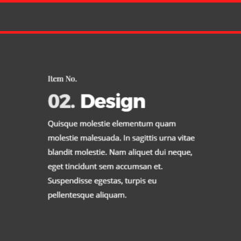
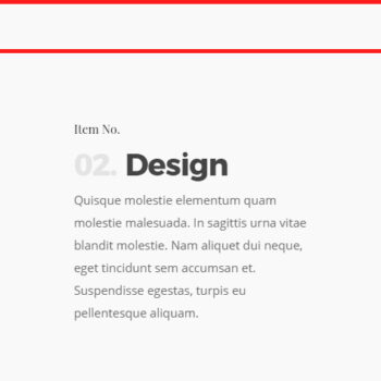
This allows you to set the row text to display as dark (default) or light for the text color.
This setting is also tied to the permanent transparent header theme option. When using that theme option, the transparent header navigation color will change its color based on what your row color is set to. Example below.


